

Visualizing Time Series Data with Chart.Js
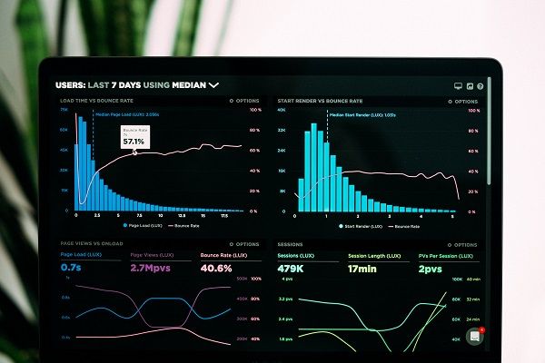
Time-series data is a set of measurements and observations taken over time. Visualizing data makes it easier for users to understand specific information.
This tutorial will help readers understand how to visualize time-series data using Chart.js and InfluxDB.
InfluxDB is a database created with time-series data in mind. You can efficiently present time-series data by combining the features of InfluxDB with the flexibility and power of Chart.js.
Table of contents
- Prerequisistes
- Time series data
- Visualizing Time Series Data with Chart.js and InfluxDB
- Using Flux to query data from the InfluxDB cloud
- Conclusion
Prerequisites
To follow along, you need some knowledge of HTML, CSS, and JavaScript. Note that we will use VS Code editor as our development environment.
Time-series data
Time is a crucial factor when recording data that evolves constantly. Such data enable people to understand the past and predict the future.
Time-series data is present in sectors such as business, finance, economics, and health. It can also be found in other scientific fields that tend to show patterns such as trends, seasonal fluctuations, irregular cycles, and variability.
Time-series data is gathered from the real world and analyzed by a computer to generate a graphic and analytical output.
The results of the data analysis provide us with more information about real-world situations. Data can be collected yearly, quarterly, monthly, daily, or even hourly.
Examples of time-series Data
The stock market. This market is highly volatile and time-sensitive. Therefore it is essential to monitor and record the data whenever there are transactions.
In the healthcare industry, time-series data is used to monitor the heart rate of patients taking particular medications. This ensures that their heart rate does not fluctuate too much at any given time.
The weatherman uses time-series data to predict what the temperature will be during different weeks and months.
Retail businesses use time-series data to track their total sales over time.
Aspects of time-series Data
- Trend: The overall direction of the series.
- Seasonality: Occurs when repeated behavior in the data happens at regular intervals.
- Cycles: Arise when a series follows a non-seasonal up-and-down trend.
- Unexplained variation.
Visualizing time-series data with Chart.js and InfluxDB
Chart.js overview
Chart.js is an open-source library that helps users easily visualize data using JavaScript. Chart.js is similar to Google Charts and D3.
Most developers prefer Chart.js because it is simple, flexible, lightweight, and reliable. In addition, it allows us to create clean, elegant, and responsive charts using the HTML5 canvas element for effective communication.
Setting up a Project with Chart.js
There are several methods to get started with Chart.js, as detailed in this guide. In our case, we will use a CDN.
To get started, open VS Code and create a folder that will hold the project files. Next, create index.html, script.js, and style.css files inside the folder.
Add the following code in the index.html file:
<!DOCTYPE html>
<html lang="en">
<head>
    <link rel="stylesheet" href="style.css">
    <script src="https://cdnjs.cloudflare.com/ajax/libs/Chart.js/3.7.1/chart.min.js"></script>
    <title>Visualizing Time Series Data with Chart.js</title>
</head>
<body>
    <h1>Chart.js</h1>
    <canvas id="charts" style="width:100%;max-width:700px"></canvas>

    <script src="script.js"></script>

</body>
</html>
As mentioned earlier, there are various types of charts in Chart.js. In this tutorial, we will use line and bar charts. After grasping these concepts, you will have the expertise and confidence to work with various charts.
To develop time-series data, we will use a dataset of the petrol consumed by a pump per day in liters.
var days = ["Mon", "Tue", "Wed", "Thur","Fri", "Sat", "Sun"];
var litres = [150, 90, 95, 130, 85, 180, 85];
Chart.js line chart
Set the chart type to line to generate a line chart. We need to include our script.js and style.css files in the index.html file.
Add the following code in the script.js file:
charts = document.getElementById("charts");//html canvas
//values of x and y axes
var days = ["Mon", "Tue", "Wed", "Thur","Fri", "Sat", "Sun"];//x axes
var litres = [150, 90, 95, 130, 85, 180, 85];//y axes
//create a line chart
new Chart(charts, {
    type: 'line', //This is a line chart
    data: {
    labels: days, //x-axes data
    datasets: [{
        label:"Line Chart",
    data: litres, //y-axes data
    borderColor: 'black',
    fill: false,
    }]
    },
   });
Add the following code for styling the webpage in the style.css file:
body{
    background-color:black;
   }
   h1{
    color: black;
    margin-left:4px;
   }
   #charts{
    margin:auto;
    background-color: white;
   }
Output:

Chart.js bar chart
In the same way, we specified the chart type above; you need to modify the chart type to bar.
The fill option is not required when working with bar charts because they inherit the background color by default.
Proceed to add the snippets below to the script.js file:
charts = document.getElementById("charts");//html canvas
//values of x and y axes
var days = ["Mon", "Tue", "Wed", "Thur","Fri", "Sat", "Sun"];//x axes
var litres = [150, 90, 95, 130, 85, 180, 85];//y axes
//create a line chart
new Chart(charts, {
    type: 'bar', //Declare bar chart
    data: {
    labels: days, //x-axes data
    datasets: [{
        label:"Bar Chart",
    data: litres, //y-axes data
    backgroundColor: 'black',//bar charts color
    }]
    },
    options:{
        legend: {display:false},
    }
   });
style.css file:
body{
    background-color:white;
   }
   h1{
    color: black;
    margin-left:4px;
   }
   #charts{
    margin:auto;
    background-color: cyan;
   }
Output:

InfluxDB overview
InfluxDB is an open-source time-series database written in Go and developed by Influx data.
It is designed to store and retrieve time-series data quickly. Moreover, it works seamlessly with the right platform to collect, store and analyze data.
Setting up InfluxDB
To get started with InfluxDB, head over to their official website and download it.
It is essential to have an instance of InstanceDB up and running. In addition, sign up for a free InfluxDB cloud account.

We will install InfluxDB version 2.1 and then choose Windows as the desired platform. Next, click on the URL, and the download will start by default.
When the download completes, unzip the file to your desired location. In our case, it's in the Programs Files folder.

Start the InfluxDB server by navigating to the command prompt and running the following command:
cd C:\Program Files\InfluxData\Influxdb\influxdb2-2.1.1-windows-amd64

To start InfluxDB, run the command influxd.exe. You should see the output below:

We will need to create an account in InfluxDB Cloud. Then install the InfluxDB client library.

We will install the InfluxDB Javascript client library, which is a Node.js module in the application folder.
npm init -y influx-node-app
npm install @influxdata/influxdb-client
Using Flux to query Data from the InfluxDB Cloud
Flux is a functional, extensible, and composable data scripting language designed for time-series data.
It queries, analyzes, and acts on data, then visualizes the results. It has support for querying data from various sources, including CSV and SQL.
Flux creates some composable functions to use as building blocks. A Flux query retrieves data from the data source, filters it based on time or column values, processes the data, and returns results.
In InfluxDB, we have buckets that act as databases. To create a bucket, navigate on the left side and select Load Data, as shown below:

Next, create a bucket as shown below. You can quickly populate it with data and submit a query:

Once you submit the query data, time-series data visualization occurs.

Conclusion
Chart.js is a graphing library with numerous functionalities. You can look at Chart.js documentation to learn more about it.
InfluxDB is a time-series database to store, analyze, and visualize data using bar charts and scatter charts.
In this tutorial, we learned about time-series data and how to analyze and visualize this type of data using Charts.js and InfluxDB.
We also built a working example to visualize time-series information and used Flux to query data from an InfluxDB cloud.
Happy learning!
Peer Review Contributions by: Mercy Meave


Cloudzilla is FREE for React and Node.js projects


